
For decades, football analysis relied mainly on goals, assists, and basic pass counts. But in the modern game, where marginal gains decide titles, analysts, coaches, and enthusiastic fans want to know more than just what happened; they want to know where it happened. This is why heat maps are now popular in football analytics. These visual tools transform the raw, chaotic data of 22 players moving across a pitch into instantly understandable color gradients. A quick hook: football heat maps reveal hidden tactical insights by showing the areas of the pitch a player or team dominates, often exposing strategies that are invisible to the naked eye.
What Is a Football Heat Map?
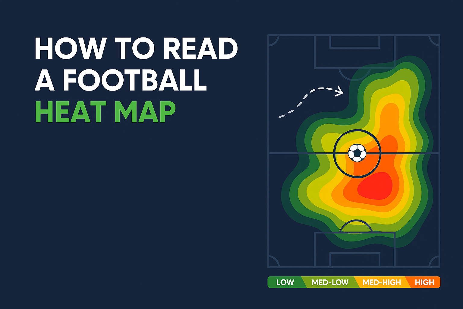
A football heat map is a visual representation of player activity on the pitch. The field is shaded in colors, usually ranging from blue (low involvement) to red (high involvement). The hotter the color, the more frequently the player or team operated in that zone. Think of it like a weather radar for the pitch.
How Colors Represent Activity
The interpretation hinges entirely on the color scale, which follows a consistent pattern across almost all analytical platforms:
Red (or White/Hot Colors): Represents the highest level of activity or concentration. If a striker's area is red, that's where they spent the most time or made the most touches.
Yellow/Orange: Represents moderate to high activity.
Green/Blue (or Cold Colors): Represents low activity or areas rarely visited by the player or team.
For example:
A left-back’s heat map may glow red along the touchline, showing their constant overlapping runs.
A false nine may have heavy activity between midfield and attack, highlighting their role in linking play.
How Football Heat Maps Are Created
Heat maps are generated using tracking data. Every movement a player makes whether sprinting, passing, or pressing—is recorded. The data that powers these visual insights is highly sophisticated and collected in real time.
Data Sources
Heat maps are created using positional data gathered from several high-tech sources:
- Optical Tracking Systems: Cameras placed around the stadium track the location of every player and the ball, providing highly granular data points (up to 25 times per second).
- GPS/EPTS Devices: Players wear small Electronic Performance Tracking System (EPTS) vests, often containing a GPS chip, which records their location and physical metrics like distance run and acceleration.
- Data Providers (Opta/StatsBomb, etc.): These companies aggregate the raw positional data and match events (passes, tackles, shots) to generate detailed player movement profiles.
This data is then processed into visual overlays, making millions of data points easy to interpret in seconds.
Frequency of Data Points and Accuracy
The accuracy is incredibly high. Because modern systems log hundreds of data points per player per game, the resulting heat map is a statistically reliable representation of their true zone of influence.
Reading a Football Heat Map Step by Step
Interpreting a heat map is more than just looking at the red splotches; it’s about contextualizing them within the player’s role and the team’s formation.
Identifying Player Zones of Influence
A midfielder's heat map might show a dense red cluster in the center circle and a large orange area around the opponent's box. This immediately tells you they are the primary deep-lying playmaker, distributing the ball from the middle of the park.
Spotting Attacking vs Defensive Contributions
Attacking Focus: Red areas concentrated in the final third, especially near the opponent’s box or the wings, indicate a player with a strong offensive mandate (e.g., an attacking winger or forward).
Defensive Focus: Red areas concentrated in their own defensive third, particularly within the penalty box or the edge of the area, highlight a player who is primarily tasked with defensive duties (e.g., a centre-back or defensive midfielder).
Comparing Home vs Away Performances
A player might show a much wider and more attacking heat map when playing at home (where the team typically dominates possession) compared to an away game against a stronger opponent, where their map will be pulled back into the defensive half. This comparison reveals tactical flexibility based on the match scenario.
Types of Football Heat Maps
While the most common is simple player positioning, analysts use specialized maps for deeper insights.
1. Player Movement Heat Maps
This is the standard map, showing where a single player was over the course of the game, indicating their spatial coverage.
2. Team Tactical Shape Heat Maps
These maps combine the positional data of all 10 outfield players to show where the team, as a whole, focused its play. A tactical map for a counter-attacking side might show very little red in the opposition half, while a possession-based team would show hot spots across the pitch.
3. Possession and Pressing Heat Maps
Possession Maps: Focus specifically on where the ball was controlled, showing the areas where the team holds onto the ball longest before progressing forward.
Pressing Maps: Pinpoint the areas where players made tackles, interceptions, or pressures. A striker with a red area high up the pitch shows they are crucial to the team's high press.
What Heat Maps Reveal About Players
Heat maps provide concrete evidence to back up subjective observations.
Strengths (e.g., Full-backs Overlapping)
If you see a full-back's heat map with dense red activity stretching from their own box all the way into the opponent's final third, it confirms their key strength is overlapping runs and attacking width, revealing them to be a modern wing-back.
Weaknesses (Isolated Striker Movement)
A striker's map showing a small, tight red spot only around the center circle, but almost no activity in the penalty box, suggests they were isolated and not getting into goal-scoring positions. This points to a tactical weakness, not necessarily a personal one.
Consistency Over Multiple Games
By comparing heat maps across a season, analysts can assess consistency. Is that attacking midfielder always wide on the right, or do they drift centrally? Consistent hot spots indicate a highly disciplined or specialized role.
For example, N’Golo Kanté’s heat maps over the years reveal his tireless defensive coverage, while Lionel Messi’s show his gradual shift from right wing to a more central playmaker role.
Practical Uses of Heat Maps
These visualizations are not just for pundits; they have crucial, real-world applications in the professional game and for fan engagement.
Player Scouting and Recruitment
Recruiters use heat maps to determine if a player truly fits the spatial requirements of their team's system. Does a potential new defensive midfielder cover the necessary ground on both flanks, or is their influence too narrow?
Opposition Analysis
Before a match, a coach will study the opposition's team heat map to find space to exploit. If the opponent’s map shows a blue patch in the left midfield channel, the coach knows to instruct their right-sided attacker to operate in that area, as it is underserved defensively.
Fantasy Football and Betting Decisions
For fantasy managers, a heat map showing a full-back spending all their time in the attacking half suggests a high potential for assists. For betting, a team’s heat map indicating deep, defensive positioning (even if they win) suggests they might not score often in future matches.
Tools to Access Football Heat Maps
You don't need a multi-million-dollar scouting department to access these insights.
Free Websites
WhoScored & SofaScore: Excellent for post-match analysis, often displaying player-specific heat maps for key games.
FotMob: A popular mobile application that includes basic player heat maps in its match statistics.
Pro Tools
Wyscout & InStat: These platforms offer professional-grade tools used by scouts and coaches, including the ability to generate specific tactical heat maps based on highly filtered data (e.g., only when the score was tied).
StatsBomb: Provides access to advanced positional data often used by elite clubs.
Final Thoughts
Football heat maps turn complex tracking data into easy-to-read visuals that anyone can understand. Whether you’re a coach analyzing tactics, a scout evaluating talent, or a fan looking to deepen your football knowledge, heat maps provide a powerful way to interpret the game. Combine them with other metrics like xG (expected goals), possession stats, or pressing data, and you’ll gain a far more complete picture of what’s really happening on the pitch.